By Deanna Hammond-Blackburn
Here is a group of the best and worst photographs taken for the different pages of the music magazine. The decisions on selection or rejection were made through how well i felt the representations i wanted were portrayed, how well the framing/lighting/posing went and also the opinions of the public who commented on my photos using Flickr. These comments and more photos can be seen here: http://www.flickr.com/photos/deanna-ami/Contents Page

Selection 1: I chose this photo as the framing and lighting are good and the expression on her face is engaging to the audience. The background of the black curtain is effective as it adds drama to the picture and helps give the overall image a musical feel to it. With some editing to levels this picture would be acceptable on the contents page.

Rejection 1: I decided not to use this photo or other similar ones as the lighting on her isn't as good as the others and her pose looks less relaxed. As her face is turned away from the camera the photo is a lot less engaging and less interesting for the readers. Being able to see the stage blocks also makes the photo look a lot less professional.
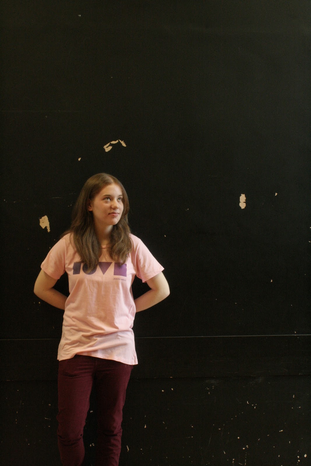
Selection 2: I like this photo as her pose and expression are natural and they look good, she is well lit and the background again helps add drama to the picture. Her pink t-shirt saying 'LOVE' is clear and stands out against the black; this helps emphasise the theme of Valentines which is what i wanted. By cropping the image and tidying up the background this photo would be acceptable for the contents.

Rejection 2: This photo isn't being used mainly due to the lack of detail on her face due to camera shake, and the lighting is very bright. Although the pose is good, the framing makes her look small and this isn't the representation I was aiming for. The combination of black curtain and bright orange flooring is also distracting and looks unprofessional.
Selection 3: This is one of my favourite shots as the overall feel of the picture is very sophisticated and it looks how a professional shot in a music magazine would. The colours and her costume are in the theme of Valentines which is what I planned for and the expression on her face is engaging and would interest the readers. A closer cropping would just improve this a little more.
 Rejection 3: I decided not to use this photo mainly due to the soft focus and the poor framing. Although I like her expression, i feel it doesn't exactly give the impression of a Valentines edition or even of a music magazine really, and the framing has cut the top of her head of which wouldn't be as much of a problem if the shot was an extreme close-up. The lighting is also insufficient as her hair is very dark on the left.
 Selection 4: This photo is one of the best for lighting, and the low angle of the shot makes it a lot more interesting with the different representations it portrays. Her natural pose and expression compliment the low angle shot well as she doesn't become overpowering. Cropping would improve this shot.
Rejection 4: This photo was rejected because the detail and lighting are quite poor, especially on her face. There is a large white patch on the right and her arm is also very white. Although the pose is natural and okay, I don't particular like the expression on her face as it doesn't portray the representations I wanted.

Selection 5: I like this photo as his expression and confidence makes the photo highly engaging. The lighting and framing are good as they help focus on him and the guitar. The props help make the image look musical and quite indie too.


Selection 6: This photo is selected because the representations are portrayed very well and the overall feel of the photo is musical and romantic. The tight framing ensures the focus is on him, and his expression and being in direct mode of address makes the photo very engaging. The lighting is good as there are no overly bright white patches or dark black patches and his face has good detail.

Rejection 6: This photo is rejected because the lighting on this image is poor; his shirt is very bright and the detail is lost there, also he is blinking. The framing is okay but he should be further centre frame for this to look better. The pose is natural but the expression on his looks out of place.
DPS

Rejection 1: For the double page spread, this photo is insufficient as the background looks quite unprofessional and the framing is very poor. There would also be very little space for text as the whole photo is quite busy, so it wouldn't be suitable for the double page.

Selection 1: This photo is selected because the framing is pretty good and the overall image portrays the representations I was aiming for. The background is what pulls the photo down a little, but this can be edited on adobe photoshop. The pose and expression are both natural and relaxed, the guitar links to the indie genre and the rose links to the Valentines edition side of the magazine.
Front Cover

Rejection 1: The background on this photo is the main problem as it is incredibly cluttered and editing this on adobe would be difficult; it would look unnatural and unprofessional. The framing is also quite poor as part of his knee is cut off - this also looks unprofessional. His expression and pose are good but not for a front cover as there's not much space for text/pugs/puffs etc.

Selection 1: This photo was selected because I love the pose, the lighting is good and the framing is good (although cropping will improve). The rose links to the Valentines, and his costume links to the music and is also quite indie. There is plenty of detail in his face and his expression is natural and relaxed. With some editing this photo can look professional and classy.
No comments:
Post a Comment