By Emma Hall
These are some examples of photographs I rejected from my shoots, along with those I selected, and my reasons for this. I based my decisions from my own knowledge and judgment as well as opinions from other people who commented on the photographs I uploaded onto Flickr. These comments and a wider selection of photographs can be found here: http://www.flickr.com/photos/deannaandemma/
Contents Page
 Reject 1- I have
not selected this photograph, and others similar to it as they have less
detail, and are not vey engaging. The model is not projecting much confidence
or distinctive style, and the lighting emphasises the dullness of the
background, as well as being behind the model making her face lose light and
detail.
Reject 1- I have
not selected this photograph, and others similar to it as they have less
detail, and are not vey engaging. The model is not projecting much confidence
or distinctive style, and the lighting emphasises the dullness of the
background, as well as being behind the model making her face lose light and
detail.
Select 1– I have
chosen this photograph as it is a very natural position and the model has a
confident smile that is engaging as she is in direct mode of address. She is
also reasonably well lit, though the picture quality is not very good when
zoomed in. However for a small contents page picture, and with some refining
using Adobe, this picture is quite good.
 Reject 2 – I have not
selected this photograph, though it was the best of my first photo shoot, as
the high ISO and Aperture mean the face is too blurry and has very little
detail. However, as the photograph mise en scene was good, I chose to re-shoot
it.
Reject 2 – I have not
selected this photograph, though it was the best of my first photo shoot, as
the high ISO and Aperture mean the face is too blurry and has very little
detail. However, as the photograph mise en scene was good, I chose to re-shoot
it.
Select 2- Instead, I
have selected this image, which has the same mise en scene and pose, but is
shot using a lower aperture and ISO to achieve a clearer image. The camera is
also focused onto the model’s face instead of her dress, so the musician is at
the forefront instead of her attire.
 Reject 3- I chose to
discard the results of this photo shoot all together, as the setting, pose,
makeup and costume were too casual for an indie music magazine, and the detail
was again not very good due to the high ISO and Aperture, though the headphones
were a nice musical touch, which lead me on to using the same model in a
different context below.
Reject 3- I chose to
discard the results of this photo shoot all together, as the setting, pose,
makeup and costume were too casual for an indie music magazine, and the detail
was again not very good due to the high ISO and Aperture, though the headphones
were a nice musical touch, which lead me on to using the same model in a
different context below.
Select 3 – I have
selected this photo as the composition is different to the conventions of most
contents photos as the focus is on the technology and not the artist, with her
head cut out of the frame. I chose to do this as I wanted a featured article on
the hidden technicians behind the music, and so my photograph had to reflect
this. The emphasis on music instead of beauty is also a common theme in indie
magazines. The detail was also quite clear, with just some brightening to be
done on Adobe.

Reject 4 – I have
not selected this image as without any visual stimulus is difficult to tell tht
the lighting was created by a street lamp at night, and instead, the colours
look strange. The light is also further away from the model here, making her
less well-lit. The pose is very relaxed and confidant, and the clothes
appropriate, but the background is a bit uninspiring. Also in order to get a
visible picture at night, I had to use a slower shutter speed, which resulted
in a loss of detail.

Select 4 – I have
decided upon this photograph, as it is well lit by the lamp and although the
model is not in direct mode of address, it is still engaging. Again, for an
indie magazine, it is appropriate for the guitar to be featured, as the
emphasis is on musical ability, whilst the model looks stylish but not overtly
sensual.
 Reject 5– I
rejected this image as it didn't fit well with the confidant, sophisticated
indie musician style that my magazine will have. The model looks more sad than
contemplative, and having her sat down weakens her representation as a woman.
Also, for a spring issue of a magazine, the model looks too cold. The focus has
also shifted to the church at the back instead of the model, though the
lighting is good.
Reject 5– I
rejected this image as it didn't fit well with the confidant, sophisticated
indie musician style that my magazine will have. The model looks more sad than
contemplative, and having her sat down weakens her representation as a woman.
Also, for a spring issue of a magazine, the model looks too cold. The focus has
also shifted to the church at the back instead of the model, though the
lighting is good.
Select 5 – I have
chosen this image as the pose makes the model look very confidant, and the
waistcoat and starry top are very individual and edgy, which is a code of indie
magazines. She is also well lit and in focus, with a good level of detail.

Reject 6 – I
didn't choose this photo as the pose makes the model look less confidant, and
the turning of the head emphasises the faults in the quality of the text on her
face. However she is well lit and the colours are very vibrant.
 Select 6 – I chose
this photograph, as the colours are vibrant and very individual, with the
background very sophisticated for my older audience. Her direct mode of address
is also very engaging, and the composition follows the rule of thirds. The face
is also in good focus and detail, with the text being noticeable without being
distracting from the beauty of the model.
Select 6 – I chose
this photograph, as the colours are vibrant and very individual, with the
background very sophisticated for my older audience. Her direct mode of address
is also very engaging, and the composition follows the rule of thirds. The face
is also in good focus and detail, with the text being noticeable without being
distracting from the beauty of the model.
Double Page Spread
 Reject 1 – Although
this photograph is well framed with the lake adding a nice natural sign, and
the image is clear and well-lit, the model does not appear as confidant as a
popular singer would be, and as her eyes are looking down, she does not engage
with the reader.
Reject 1 – Although
this photograph is well framed with the lake adding a nice natural sign, and
the image is clear and well-lit, the model does not appear as confidant as a
popular singer would be, and as her eyes are looking down, she does not engage
with the reader.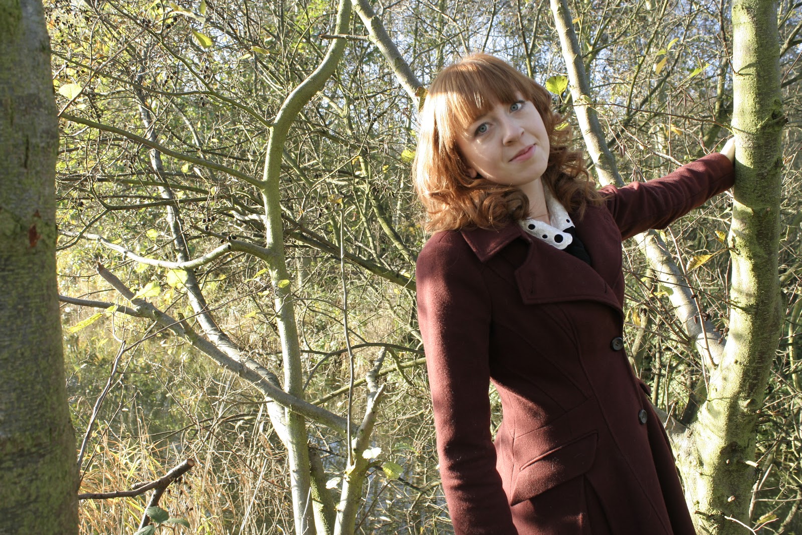
Select 1 – This
photograph is very sharp, with the model relaxed and carefree leaning away from
a tree in an almost child-like way. The coat is also quite old-fashioned and
has an indie feel to it in its uniqueness, though it still looks fashionable
and suits the model’s figure. I can adjust the photograph using Adobe Photoshop
to make the background less detailed, to further push emphasis onto the singer.
Cover

Reject 1 – I
decided not to use this photograph as although the model looks very stylish,
with her outfit in complete view, and she has an air of confidence in the way
she looks at the flower, it is not really suitable for a cover, as my research
showed most cover images are in direct mode of address. Also, the image could
be sharper and more focused on the artist’s face.

Select 1 – I chose this
photograph, as the model’s face is very clear, and the positioning of the model
and the flower is very centred, and so would be easy to fit text around. The
camera angle also makes the artist look powerful without being too radical. Her
expression is also that of quiet confidence, and the hair and make-up is
flattering and sophisticated.
Add your hyperlink to flickr
ReplyDeleteMiss King