Tuesday, 23 October 2012

Research - Music Magazine Contents Page - Similar Product Research

By Deanna Hammond-Blackburn and Emma Hall


The contents page DPS contains 8 main images that promote the different articles. The smallest image is a full shot of Noel Gallagher, who has his own section as he is the subject of the main image on the front cover. The image on the contents is small as it has already got a lot of exposure on the front, as well as a massive 9 page spread in the main magazine. In both images he is stood with a large amp, but in different poses. On the contents page, Noel is leaning against the amp in a blue shirt and jeans, very casually. This represents him as a normal guy; the magazine is focusing on his musical side rather than his physique. This fits the genre of the magazine, but breaks more common male representations. The largest image on the contents is a mid-shot of Adam Ant with a large dog. He is wearing mostly black with some red, which links to Q’s house style. The representations of this are again more about his music and personality than his physique, while his masculinity is being portrayed by being pictured with a large dog.

The contents page is split into sections, with headings written in the house style, with a white font on a coloured banner. The colours of the banners are very limited, using only grey, black and red. The page numbers are all quite small and there is a lot of text for each one, as the older readership of the magazine is more likely to have the patience to read through each section than a younger reader would. The page numbers are white in a red square, which resembles the ‘Q’ logo, while each feature has a red sans serif title, then black serif writing. This means there is consistency across the whole page, along with the shared sophisticated white background, and makes it all connect. The main heading of ‘Content’ is in a simple black font that would be quite uninteresting, if it weren’t for the cartoon characters integrated into it, which are linked to an article, explained by a short piece of anchorage text off of an arrow.

The language used on the contents is a mix of consultative and casual register, as the reader is likely to be intelligent enough to understand terms like “rendezvous”, but a s the contents page needs to grab attention quickly and encourage people to buy it with the magazine’s unique selling points, the tone needs to also be informal enough to make readers feel welcome and be invited in. Also, the readers of ‘Q’, predominantly male, tend to be quite dedicated to the music and so several language signs are used under the assumption that the readers will understand what they are referencing: “prancing hermaphrodites and a meat wardrobe, it’s got to be the Lady GaGa tour”, for example is only understandable if you live in the Western world, and have been keeping up with gossip about the singer.

The main features have text that cut into the pictures using a white box that blends seamlessly into the background for a sophisticated effect. ‘The Q Review’ has its own section off to the right, emphasised with double lines, a striking red banner and a large photo. There is also a flash to advertise its improved ‘bigger and better’ section which both emphasises and justifies this feature’s prominence on the page.

Techniques such as more subtle representations of people, smaller and more text for a slightly older target audience, a sophisticated and consistent background with integrated house style and more sophisticated vocabulary and signs that the readers will be able to identify with, should all be incorporated into our own magazine.

Monday, 22 October 2012

Target Audience Survey


By Deanna Hammond-Blackburn and Emma Hall


Media Music Magazine Survey

How old are you?

…........................................

What is your gender?

…........................................

What music genre do you listen to?
  • Pop
  • Rock
  • Metal
  • Indie
  • Country/Western
  • Other
    …............................

How do you prefer to listen to music?
  • CDs
  • Radio
  • Music Channels (TV)
  • Ipod
  • Iphone
  • Ipad
  • Youtube
  • Other
    …............................
How often would you want a music magazine to be brought out?
  • Weekly
  • Monthly
  • Bi-Monthly
  • Annually

Would you subscribe to a magazine?
  • Yes
  • No

If Yes, would you prefer it if the magazine:
  • Was delivered to your house
  • Was available to you before others
  • Was available as a digital edition on the internet.

How much would you be willing to pay for a magazine?
  • £1.50-£2.00
  • £2.00-£3.00
  • £3.00-£4.00
  • £4.00-£5.00
  • £5.00 and over
  • Upfront annual subscription

What features would you want in a magazine?
  • Band Interviews
  • Album Reviews
  • Festival Reports
  • Competitions
  • Quizzes
  • Event Lists
  • Other
    …........................

Would a freebie on the front of a magazine encourage you to buy it?
  • Yes
  • No

Which colour scheme would you be drawn to?
  • Black and White
  • Purple
  • Ice Blue

Which magazine name do you prefer?
  • Vive
  • Suite

Have you ever been to a music festival?
  • Yes
  • No

If Yes, how many?

…......................

Have you ever been to a band's concert?
  • Yes
  • No

If Yes, how many?

…....................

Which shop would you buy clothes from?
  • Primark
  • New Look
  • H&M
  • Topshop/Topman
  • River Island
  • House of Fraser

    As well as paper copies, the survey was also completed using a digital copy linked to Facebook. This copy of the survey can be found here:
    http://www.surveymonkey.com/s/JJP72SB

    and part two of it here:
    http://www.surveymonkey.com/s/JRQHLZZ

Research - Music Magazine Double Page Spread - Similar Product Research

By Emma Hall

 
The photograph on this DPS spreads across both pages and dominated the spread, leaving only a third for text, and so really stands out. The colour scheme overall is very limited, using black, white and pink to highlight things. The use of a black and white photo reflects the fact the album being discussed is not new, but is being re-released. The photo is of the four band members, with boys on the outside, turned inwards to push the focus onto the two girls in the middle. They are all in direct mode of address which makes the reader feel slightly unsettled, as if outnumbered, especially as the band members all have expressions of almost-smiles that are almost unnerving.

They are all wearing regular, casual clothed, and have hair in a scruffy style, which ties in with the use of the word ‘nightmare’ in the title. The band shows both men and women in equal measure, shown through how one girl and boy are in the foreground, and one girl and boy are in the background. The women, however, are represented as quite tom-boy in style, with one having a short masculine hairstyle, nose-stud and a single earring, whilst the other girl has longer hair, that is all tasselled and doesn’t look taken care of. This image does not follow the media tradition of dressing women in glamorous, figure-complementing clothing. The men do not look particularly well-dressed either, nor is there physique highlighted. Instead, they have quite long hair, for men, which makes them look youthful and unruly. The leather jacket, crossed arms, piercings, scruffy clothes and defiant expressions are all indexical signs for a group of young people who are quite rebellious and up to no good, who want to defy the rules of society and live their own way. These are used in conjuncture with the language sign in the title “F**king”, which is also very defiant of good society, although the magazine shows itself to be of a politer nature, and masks the swear word using stars.

This hard-edged image is contrasted by a softer title, which uses a pink, serif, curled italic font to introduce the article, and a pulled quote in bold white, which creates intrigue and is the biggest  pull to read the article as the swear word is very blunt and in your face. The italic font is part of the magazine’s house style, and the use of this and the pink colour scheme tones down the rebellious tone of the article for the target audience, who having listened to the music when it was first released ten years ago, will have grown up since then, and be in their late 20s now, and be out of that teenage faze. The white background is slightly more sophisticated, as is the use of pulled quotes and drop capitals in pink to separate the text into sections. The use of pulled quotes in this fashion, as crossheads, is a code becoming more and more frequent in magazines in recent eras, and is something I could take forward into my own design ideas. The pink colour also links with the image of the album featured in the middle with another pulled quote, which the text wraps around neatly, creating guttering. At the bottom is also a small, related paragraph from another artist concerning the album, and is backed on a coloured rectangle in a similarly patterned pink. This gives the page consistency, and it is headed by yet another pulled quote.

The article is written in a consultative register, and is quite sophisticated in both its vocabulary and domain; expecting the reader to be intelligent enough to keep up with topics varying from the financials of record production to the emotions behind instrumentation. One particular section, where the author gives his particular view on the album, uses a series of symbolic signs that require a certain sense of humour to understand. It begins with a string of similes “It is like an angel snorkelling in marshmallow”, ”like a nuclear winter”, “the aurora borealis exploding”, “a serene suicide cult ascending to the mother ship”, before following with “in other words, it’s like nothing ever heard before”. This is intended to be interpreted as a long-winded joke that basically means the music is entirely unique. However not all readers may be able to see this, or be able to pick up on the paradoxes used in the similes which indicate this meaning. The similes themselves also have a sci-fi theme running through them with words like “inter-dimensional wormhole”, “cult” and “mother ship” being used, which signify that the music has an outer space, other worldly quality to it, enhanced by words like “vibe”, “psych-noise” and “sonic” being used elsewhere in the article. All of this gives the reader more of an impression of how the music would sound than in most articles, and reinforces the theme of uniqueness and individuality that was stimulated by the photograph.


The page is split into three vertical columns, with a short introductory paragraph to the left, a large photograph in the centre, and a Q&A to the right. The photograph features a mid-shot of Noel from below looking up, making him seem both powerful and yet lonely, as he is quite small in comparison to the large ceiling of the atrium behind him. He looks up with his hands in his pockets, making him seem hopeful, and yet sad, with his grey hair and leather jacket contrasting the grandeur of the marble columns and the golden sheen of the backdrop. This makes him seem like a fish out of water, reflecting his new journey on his own into a new world. This is also signified by the fact he is stood in a building at Liverpool Port, symbolising his journey out from his home, where he’s comfortable, and out into the new. This is a typical representation of a man, being tough on his own, though his loneliness also makes him seem vulnerable, and his grey hair also emphasises his age.

The rest of the article uses only black and white, which also reflects the fact Noel has been in the business a while, though it is also quite a modern look. Drop capitals are used to show the start of paragraphs, whilst the questions in the Q&A are bold to differentiate them from the answers. A pulled quote is backed on a banner which is quite elegant, and the black with white text really makes this section stand out. The serif font used throughout also makes the page look quite sophisticated and expensive, and this links also with the aspirations of the singer.

The register used by the interviewer is consultative and polite, as Noel is quite famous, while Mr Gallagher’s register is quite casual and comfortable, swearing and laughing. The language from Noel is less formal and is simple, reflecting his common background, compared to the interviewer, whose profession demands a formal more complex vocabulary. This is evident in the introductory section, where the language is tailored for the older readership, but the interviewer also used signs like ‘Mo Farah’ and ‘Man City’ to prepare the reader for the common language used by Noel. These signs are quite iconic and would be easily recognised by British readers; however they would not be identifiable for an American audience. However a British audience would be able to immediately connect with the ideas and their inclusion brings the famous Noel down onto a human level.

Research - Music Magazine Double Page Spread - Similar Product Research

By Deanna Hammond-Blackburn


On this DPS all of the left page and two thirds of the right page are taken up by a full shot image of the band Muse. The 3 men are in the middle/ to the left of the image, with the dark but colourful background of lights at a stage set taking up the rest of the photo. The men themselves are all stood in casual poses and dressed in smart/casual dark clothes; with the background being dark and also their clothes being dark it suggests that the set of their gigs directly represent them and the style of their music, however the bright colours also represent their music and personalities. The magazine, similar to that of Clash and Q, focuses on the emotional and mental side to the men rather than their physical attributes, this representation is commonly seen through this genre of music magazine and we should definitely conform to this convention in our own production. All the men are in direct mode of address.
In the background there is what seems to be and upside down pyramid, which is a polysemous symbolic sign. Typically, a pyramid signifies power structures and knowledge, therefore by having an inverted pyramid the signified meaning changes slightly. Now, the representation is about the band’s personality and how they are intelligent but seem to portray themselves as breaking stereotypes by not conforming to traditional power structures.
In the top right of the image is a caption, in red and white, saying; ‘Three men and a little tour. Dom, Matt and Chris prepare Wembley.’ The red and white links to the main text. By saying ‘prepare’, this suggests that this gig will be huge as it is taking a lot to set up, further representing the band as hard-working people who enjoy their jobs.
Covering the image on the left page is a pulled quote; ‘It began as a sketch on a napkin…and evolved into ninja suits, a giant robot face and a shape-shifting pyramid that eats the band.’ This leads on to the anchorage text, ‘Muse give Tom Howard an exclusive behind-the scenes look at their maddest tour ever’. The pulled quote is in capitals and a large white sans serif font, the white contrasts against the dark background so it is very clear and eye-catching.  There are also signs in the pulled quote, according to Barthes theory of Semiotics, ‘napkin’ could signify the appeal to the western world as napkins aren’t commonly seen in more third world countries, and ‘sketch’ could signify how the band is artistic, spontaneous.
The start of the article is shown by a large red dropped capital. This looks quite sophisticated as it relates to the lead on the other page; this is a good technique to give the DPS consistency that we should consider using in our product. The red signifies danger, passion and love – these are all representations of the band and their music style.
The register of the text is casual and consultative, although it is an interview, colloquial language is used; ‘basically the whole thing looks f*cking amazing. ’ This makes the article more relatable and it appeals to the audience; older, middle class people.  Although there are colloquialisms, the tenor is still quite polite. 


This DPS is taken up mostly by a full shot image of Pete Doherty, with some text in the top right. The whole DPS is in monochrome and is looks slightly sepia in tone. This gives the whole image a feeling of nostalgia which represents Pete as quite traditional, perhaps old-fashioned, and that he is holding on to the past somewhat. Pete himself appears very dark; his clothes, hair and make-up are all black; this could be a direct representation of his music or his mental state. His pose is very casual; he is laying down and smoking. This portrays him as being rebellious but quite laid back. Similar to the other magazines, Clash have focused more on his personality and music than his physique by showing him fully clothed and also wearing make-up. Typically a more feminine product, the make-up helps present his personality. This is a convention of this genre of music magazine that we need to adhere to in our representations. The background is mostly cream/white which contrasts with the darkness of Pete himself, this could represent his purer and lighter side, by keeping it in the background it suggests that this isn't part of is personal image. You can see curtains in the background too which suggests secrecy and blocking things out.

In the image, signs are used to give subtle representations. The cigarette could signify his lack of caring for his health, it signifies addiction – a more subtle representation of his addiction to his music perhaps. His tattoos are also signifiers, they appear to be foreign symbols of some kind, this could signify ambiguity – how some people might not understand him.

On the left hand page there is a pulled quote; 'I'm still definitely finding my feet with the music. There's still a lot in there that's dying to get out and never has.' This anchorage text relates directly to the image as Pete looks like he could be dressed for a funeral or dressed as death itself. He also says 'finding my feet', in the image his feet are cropped out so this signifies how his fans won't understand him until he understands himself.

The typography is simple, the pulled quote is a serif font in white, while the main text is sans serif font. The register of the article is consultative and casual, this is a convention in this genre of magazine which we need to apply in our product. The tenor is also quite polite due to the consultative register and interview nature of the article. This is also a convention of these music magazines that need to be used in our magazine.


Initial Ideas


By Deanna Hammond-Blackburn and Emma Hall


House Style
Target Audience
  • Age
    -20+
  • Gender
    -both
  • Music genre
    -indie side of chart music
  • Social Group
    -festival-goers
    -city life
    -fairly wealthy
    -Southerners
    -people who buy physical CDs as well as downloads.
Colour Scheme
  • Black and White
  • Ice Cold Blue
  • Purple
    -luxury
    -lilac
Cover Story
  • Concerts
  • Festivals
  • New Bands
Name
  • Vive
  • Suite
Fonts
  • simple masthead
  • tall and thin
  • quirky
Miscellaneous
  • Straight lines
    -Angular
    -Squares
  • Rule of thirds
  • No stars flashes
  • Nothing gaudy
  • Fairly empty
  • Not crowded
  • Plain Background


Wednesday, 17 October 2012

Research - Music Magazine Double Page Spread - Similar Product Research

By Deanna Hammond-Blackburn and Emma Hall


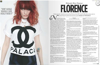
The article uses a dropped capital to mark the start of an introductory paragraph, in a very feminine, curled, calligraphy font that represents the girly, artistic nature of the singer's music. This font is repeated in a title above the main headline 'Britain's best pop star', which is almost a subliminal advert for Florence's music, and makes the article feel worthy of reading as it is about a great artist. A similar serif font is used in bold for the questions in the article, to stand out from the answers, and to give the article consistency. The font used in the main body of text is a simple, small serif font. ‘Florence’, the article title, is in the largest font and is very clear and bold; it catches the eye immediately and also tells the reader straight away what/who the article is about. The title is also underlined, which emphasises the importance and links to the strap line.

There is a lead underneath the headline, introducing the article, in the same font as the questions, and is centred, along with the rest of the page, which makes the page look balanced and look quite sophisticated. Embedded in the lead is a by line, separated slightly by being in bold. Following on from the subtlety of the underlined title, the picture credits are framed above and below by two thin lines, and the text is once again neatly centred. The symmetry is broken slightly by the drop capital, but is balanced on the right by the page number and further picture credits, which form a corner border. The whole right page is very balanced, with the gutters between columns being neat and making the text clear and legible. However, this does mean the right page is very self-contained, as nothing overlaps with the other page. The modern white background is shared though, as is the black and white colour scheme. The left page has only a photograph and a pulled quote on it, which accentuates the focus on ‘Florence’.

The photograph is a long-to-mid shot of Florence, which fills most of the page, with a little white space to either side of her, although the top of her head is cropped off. The image shows Florence as being quite glamorous even when casual, as her shirt is baggy and simple, with her hair tousled, but she is wearing gold jewellery, and her top has the Chanel logo on it. This makes her seem elegant and well-dressed without much effort. The black and white theme also relates to the old-fashioned film era, where women were typically very elegant and sophisticated. This also links to the magazine’s target audience of fairly wealthy, 20+ readers.

Her pose is quite shy and unassuming, as her head is bowed and her arms held out gingerly, but the fact she is straight on in direct mode of address and her expression suggests that she has an inner confidence. In this way, she defies the stereotypes of women being photographed for their beauty and figure, as although her face is pretty, it is hidden behind her vibrant, unconventionally red hair. Similarly, although she has the thin body some women envy, it is covered by a loose shirt. In a pop magazine, a female singer would be dressed in a tailored costume to highlight her figure, but here the singer is being focused on for her music, not her looks.

The photograph also includes signs like the interlocked C sign on Florence’s t-shirt. According to Barthes theory of Semiotics, this is an iconic ‘signifier’ for the company Chanel. Wealth is also symbolically signified to some people, depending on whether the reader has encountered the Chanel Company before. Her tattoo is also a sign symbolically signifying peace and love, as it includes images of a bird and heart. These signs work individually to show aspects of Florence’s unique identity.

The register of this DPS is consultative, as it is a formal conversation between Florence and Rebecca Nicholson in the form of an interview. The tenor is also quite formal mostly, as Florence is talking to the media, so what she says and how she says it is very important. This shows through in particular when she talks about intelligent topics like politics or ‘bipolar disease’. The latter is a sign that people can interpret differently depending on their background, as younger, less intelligent readers may not understand the term, whilst others may have had close contact with the disease and sensitive to the terms usage. In the context of the interview, I interpreted the term’s usage as part of a joke. The interview does slip into a casual register at times, when the topic of conversation turns to music as part of everyday life, and signs like ‘X Factor’ and ‘Wikipedia’ are used, which are Western terms. The informal language works as an indexical sign with Florence’s casual clothes to signify a modern, everyday woman.  The casual register is also apparent in sentences like “Yesss…yes, I would (giggles)” , which make it clear that the original medium of the interview was speech. The interview uses a consultant register prominently in her interview questions, as it is important for her to be formal and polite, especially since her and the interviewee are relative strangers. The language used in the introduction is slightly more casual, as the reporter is talking to regular readers.


Tuesday, 9 October 2012

Research - Music Magazine Front Cover - Similar Product Research

By Emma Hall

The masthead is the letter ‘Q’, which is in their recognisable house style of a red box in the top left hand corner. Underneath is a sell line ‘Discover Great Music’, which helps encourage the reader to buy the magazine. Both of these are staples of the magazine, and are recognisable enough for the main image to cover some of it enough. The main image of the lead singer of Coldplay is central and appears to be dancing, which links to the overall energetic, festival tone the cover is going for. This magazine has gone for a slightly unconventional approach and had the singer’s arm looping into the ‘Q’, which helps tie the separate elements of the magazine together and gives it cohesion. The background is quite full, and is black with neon graffiti on it. This appeals to a younger audience, as well as promoting the band’s album, which also uses this motif. Because of the multi-coloured background, limited colours are used for the text, sticking to white and yellow, which are bright enough to be legible.

 The strapline is ‘the secrets of Coldplay’, which is in a handwritten, sans serif font, to suit the younger audience, and the name of the band is in the biggest font and is underlined, so the reader is drawn in by the name of the band, and then precedes to read the rest of the line. The rest of the articles are detailed down the right-most third, and use large numbers and a mixture of font styles to grab attention, and look modern. Along the top of the magazine, is a seasonal piece of text ‘2011 reviewed’, which is positioned so it will be visible if the magazine is stacked, and will entice fans of all genres, to look back at the year. There is also a puff along the bottom detailing other features, and just uses the artists names, which means a lot of names can be fitted in and will grab the attention of fans of each artist, whilst leaving enough intrigue for a reader to flick through the magazine to find out about their favourite artist.

 Chris Martin is the only one of the group Coldplay to be shown on the cover, showing the need of male bands to have a frontman, a leader, who does the media coverage. Male bands are nearly always represented in this way, which shows the way men seem to need to be seen as independent and strong on their own terms, which wouldn’t be inferred if the picture included the rest of Coldplay behind the singer. However, the dancing position Chris Martin is holding doesn’t suggest strength. Instead it looks like an individual expression of style, and as his clothing is very casual, he looks very carefree, and comfortable in his own lifestyle. This individualism and self-expression is a common theme in indie music magazines, and is less about what popular society says a man should look like, and more about him finding his own identity. His wife Gwyneth Paltrow is also mentioned beneath the strapline, but in a slightly smaller font, a she is not directly related to the music scene, though this could also show the role of women being downplayed. However, the fact she is included at all shows how accepting this genre of music magazine is compared to more popular music, where she might not have even had a mention.


The masthead uses a very simple font that is legible, recognisable, and yet is still slightly edgy, as the L and A share a diagonal edge. The white font is slightly difficult to see against the picture, but is neutral enough to go with a variety of moods the magazine wishes to portray. In this edition, the colour scheme is very limited to shades of white, for the masthead, strapline and article list. The text is all in the bottom third and is nicely balanced by the masthead in the top third. The font for the strapline is also very unique and elegant looking, matching the elegance of the main image. There is some anchorage text beneath it which links the two well. The single word ‘Bombshell’ is also very dramatic and created intrigue into what this relates to, as well as complimenting the artist.

The main image is of Iggy Azalea, in a medium close up, with her eyes on the top third line, in direct mode of address. Her eyes are framed by eyeliner which makes them stand out against her pale complexion, and emphasise her staring gaze at the reader. Her arm is raised in an artistic manner, and she is showing the camera the writing on her fingers ‘love’ ‘live’. The abstractness of the pose, words and outfit she is wearing reflect the fact that the issue is specifically related to the fashion element of music. This specialised edition is to attract new readers by suggesting they shouldn’t miss this particular edition. As the edition is dedicated towards fashion, the representation of Iggy Azalea is towards the stereotypical, fashion model end of the femininity scale. This doesn’t reflect indie music magazines on the whole, which generally show realistic images of women. This edition however shows a typically blonde, thin, pretty girl in a pout, full of innocence and passivity. However, there is an undertone of individuality, which seems to be a code of indie magazines, as she is wearing an unusual top and hairstyle which suggests someone who has her own idea about what is beautiful. Also, unlike most modern representations of beautiful women, Iggy is very pale, not tanned, and the photograph is focused on the natural beauty of her face, not her body.

From this research, I can see that indie music magazines concentrate heavily on individual style, and defying conventions in terms of both magazine concepts, and social expectations. They also use font styles well to reflect the theme of the magazine. Another thing that seems to be a common fact, is the use of special editions, as 'Q' uses a review of 2011 feature, and 'Clash' a fashion edition, which makes the magazine seem a must-have item, and is something I can take forward into my own designs.


Research - Music Magazine Front Cover - Similar Product Research

By Deanna Hammond-Blackburn


This edition of Clash magazine uses a close up shot of James Blake, who is a new and upcoming artist. He is in direct mode of address and is centre frame, and his eyes are on the top horizontal third, which catches the readers’ eye instantly. By framing him like this it gives the representation that he is important: but the yellow background and yellow typography portrays him as physically weaker as yellow is often associated with more emotional things.
The masthead, ‘Clash’, and the strap line – both sans serif fonts - are over the top of the central image, which also reduces the sense of importance and physical strength illustrated by the framing and positioning of the image. This representation is more common in this genre of music as the magazines tend to focus more on the personalities of the musicians rather than the physique, which is breaking the normal masculinity representations. This is shown by the focus on Blake’s face. We should manipulate our use of colour combined with the central image in our magazine in a similar way to help portray the desired representations. The cover photo is anchored to the strap line ‘JAMES BLAKE’, in the bright yellow and simple, clear font, which is very eye-catching; the reader is first drawn in by the central image and then the eye is drawn down to the strap line. This makes the subject of the main article very obvious, which could be a good selling point and a bad selling point; if people like the artist then they will want to buy it, if they don’t like the artist they are much less likely to buy the magazine as a whole. This is something we need to consider when writing the DPS of our magazine.
The puffs on this front cover look quite sophisticated with the black, white and red contrasting against the yellow and checkered pattern of James’s shirt. The colours have connotations of simplicity and clarity, with the red adding excitement and danger.
 Above the masthead there is a freebies advertisement for ‘FREE MUSIC’ in black, this is an effective code and convention of music magazines and we should include one in our magazine. ‘
'Exclusive’ is used as a buzz word quite effectively as this suggests an exceptional and unusual article, thereby making the magazine more interesting. The front cover uses quite a few pugs in black and red to promote the articles; the different pugs are staggered slightly on each side which helps draw the readers’ eye across the page. This makes the cover more interesting and could be a useful page layout to influence ours from.
The central image for this edition of Mojo magazine is a mid-shot of the band Oasis, with at least 3 of them in direct mode of address. The image is very dark, the background is black and their clothes are a range of greys and blacks with minimal white. Two of them are also wearing dark sunglasses. This colour scheme represents the men as very serious with a dark side to their music, this links to the pulled quote ‘We’ve been to the dark side’ which is in red. The red suggests danger and energy. The image also focuses on their faces, suggesting that this magazine also focuses more on the personality and emotional side to the music rather than the physique.
The men are all at different levels in terms of foreground and background; the man completely foregrounded is portrayed as the most important in the group, each after that is then less important than the one in front. In a band each member has an important role so for our magazine I don’t think this technique would give the right representations, even though it does make the image slightly more interesting. However every member is layered over the top of the masthead so this emphasises their importance and represents their influence in the music industry, which could be effective for ours.
The central image is anchored by the strap line ‘OASIS’, in bright white font, like an illuminated sign, it contrasts against the darkness, thereby giving connotations of hope and renewed life. These connotations further link with the pulled quote. The masthead is very bold as the white font contrasts against the black background.

Pugs and puffs are used a lot on this cover which makes the magazine more interesting but also more crowded and unsophisticated. On our magazine we won’t use as many as we prefer the sophisticated look. In the top left is a freebie; ‘FREE CD!’ which is also in a pale grey flash. The light grey helps grab the readers’ attention as it stands out and it also relates to the actual CD as it is also mainly light grey. Linking the freebie and the actual product by colour is a good idea which we could apply to our magazine.


Friday, 5 October 2012

Research - Representation of Men and Women

By Emma Hall


I feel the physical representation of women has got worse, as women feel pressured into having the typical Keira Knightley thin figure. The news media tend to focus on the problem of this in film and television, but I think the same is true for the music industry, as there are rarely female singers who are plus sized, despite the fact they often can produce bigger voices (like Adele).
I think that the representation of women has improved in terms of having more strong , independent role models in media, however, like in the new BBC One show 'Hunted', which boasts a strong female lead in a primetime TV spot. Although there are still a lot of sidekick, femme fatale females in this area, this is not true for the music industry. In the indie sector, there are few female bands, and more female solo artists, which shows that women are not always grouped together in the media, but can successfully go it alone.   In pop, there are still a lot of press for girl-bands, like the Saturdays, but this is equalled by the representation of boy-bands, so this is clearly a sector that isn't gender specific.

 Recently, men feel the need to go to the gym more, and advertising for male beauty products has increased, targeting the common man to aspire to have a movie-physique. In this way men are growing to be as pressured as women.I agree that men tend to be shown as isolated heroes and never realistic family men, like in 'House' where the male lead never accepts help, however, thin and intelligent men are slipping into the mix more often, like Ben Whishaw as the new 'Q' in James Bond. In Indie music, men have often been the thinner variety, as shown by the trend of wearing skinny jeans and chinos which showcase the fact. This is contrasted by the R&B scene, which is still orientated mainly around muscular men, though even in this area, rap artists like Plan B and Eminem are gaining popularity.

 On the whole I think indie music defies most stereotypes, and shows a range of different characters for each gender. In my magazine, I can show this by featuring a strong independent female solo artist, or a thin male band shown to be intelligent but also highlighting their everyday, family life, to show they are real people to.